 The new iPods? Fantastic! The new features in iTunes? Stupendous.
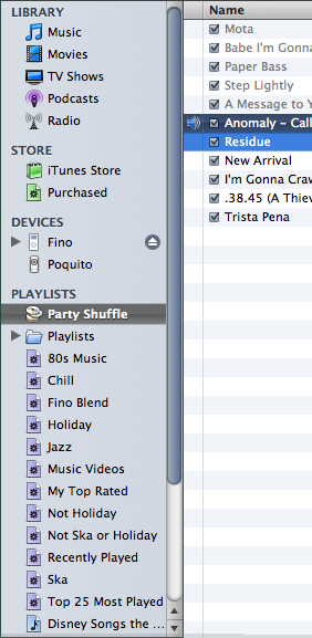
But WTF is up with the interface in iTunes v7? Seriously, the non-standard scroll bars, the atypical checkboxes, the abnormally dark selection bars...fugly. Just f-ing ugly.
For why hath these abominations been wrought upon us? What's wrong with the scroll bars in Mac OS X? Or the checkboxes? Nothing. Use them.
The new Cover Flow view is superb. (I like the similar UI in Omni Dazzle, too.) The reorganized Sources section? Genius. (I want that kind of categorization in Mail.) And iPod management within the application, instead of through Preferences? I wanna kiss someone.
But please, please, please, stop with the hideous scroll bars and lame checkboxes. They're just ugly.
And it appears I'm not the only one who thinks so.
| Post | Reference | More Info |
|---|---|---|
| "U-g-l-y, you ain't got no alibi, you're just ugly." | Lyrics from Ugly by Fishbone |


No comments:
Post a Comment